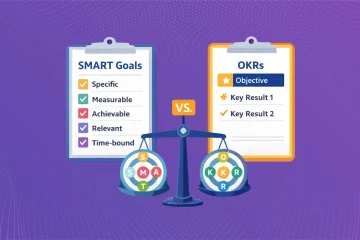
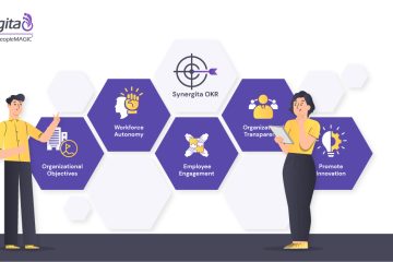
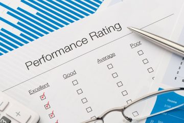
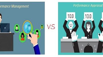
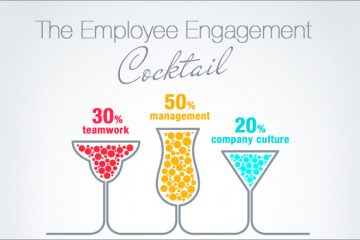
Synergita’s New UX launch

Change is the only word that remains unchanged. Change is good when it does good. The new change in Synergita will also bring about wellness to our customers and to all the visitors. Yes, Synergita has launched its new User Experience Design.

Both the elements, User Experience & User Interface are considered to be crucial, while the UX discipline moves closely around technical and analytical forum. I read it from an article where someone has described the UX design the following way: It’s interesting though.

If you imagine a product as the human body, the bones represent the code which gives it a structure. The organs represent the UX design: measuring and optimizing against input for supporting life functions. And UI design represents the cosmetics of the body–its presentation, its senses and reactions.

A great product experience starts with UX followed by UI. Both are essential for the product’s success. Our new UX is absolutely seamless and people would love to use that.

Our New User Experience has played around the following:
Improvised visual experience

You are likely to envision visual treat when you walk through the product. The product has been made completely seamless with our improvised UX.

Made the product more intuitive

The product has been made more intuitive & interactive. It’s now more users responsive and quick at it.

Easier navigation system

Visitors can experience easier navigation and standardized work flows. The system is made seamlessly moving like flipping through pages of a magazine.

Responsive UI for mobile devices

Earlier it used to be partially mobile friendly. Our customers had to use the software at all times irrespective of their vacation times, etc. So we’ve made it mobile responsive and all the features are now mobile compatible.

What are the changes that we’ve incorporated?
  1. Vertical Navigation Bar: Faster and more intuitive navigation. Available as a dynamic window that slides out from the left side of the page.
  2. Reduction in empty or blank white spaces in the forms – Linear layout reduces the need to scroll down. It also improves usage of screen space.
  3. All forms have been converted to in-line editable grids which in turn improves user experience.
  4. Responsive Layout- It’s been made mobile and tablet compatible.

Hope our new UX improves the usability, ease of use and pleasure provided in the interaction between the customer and product. Enjoy the completely new, rendezvous User Experience while taking a tour of our product.

Have a great User Experience !! Take a live tour here !!

test-drive3

Leave a Reply

Your email address will not be published. Required fields are marked *